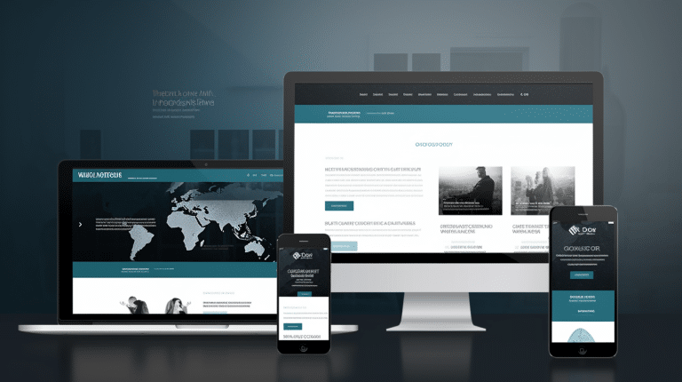
In today’s digital world, having a mobile-friendly website that is easily accessible has become increasingly important. With the right steps in place, businesses can create and maintain an effective mobile-friendly website for their customers. As such, developing an effective site requires careful consideration of design elements and user experience. Rhetorically speaking, it could be said that ‘A successful business starts with a well-crafted website.’ This article will provide nine essential steps to consider when creating an optimal mobile-friendly website for any business.
These nine steps range from understanding the customer’s needs to designing a site layout that allows for easy navigation when accessing different devices. It also includes considerations regarding content management systems as well as optimization techniques which are necessary for successful search engine results. Furthermore, this article also outlines specific strategies needed to ensure mobile users have access to all available features and functions while using their devices. By following these nine steps closely, businesses can optimize their websites so they reach both desktop and mobile users alike.
Whether starting from scratch or revamping existing sites, the appropriate process should always be followed in order to build an effective mobile-friendly website. By taking advantage of these helpful tips and tricks outlined in this article, businesses can construct a robust website that meets the needs of its intended audience regardless of what platform they use to view it.
1. Choosing A Responsive Website Platform
When it comes to creating a mobile-friendly website, the first step is choosing an appropriate responsive website platform. Responsive web design is the practice of building a site that dynamically adjusts for different devices and screen sizes. This ensures visitors can access content with ease regardless of their device type or size. In addition, by utilizing this approach, websites can be maintained more efficiently since there is only one version of code instead of multiple versions tailored to each device.
It’s important to select a platform that has support for various resolutions and provides tools that are essential in developing a good user experience. These include features such as automatic scaling images, media queries, and other CSS techniques used to create optimized visual elements across all platforms. Additionally, developers should consider if the chosen platform supports third-party plugins and widgets which may also be necessary for delivering an effective mobile-friendly website.
Overall, selecting an appropriate responsive platform forms the foundation for creating a successful mobile-friendly website. Moving forward, designers must use these capabilities to craft the layout and visuals of their respective sites in order to deliver great experiences across all devices.
2. Creating A Mobile-Friendly Design
Mobile-friendliness has become a symbol of success for contemporary websites. As such, creating an effective design is paramount to achieving this goal. To that end, there are several techniques which can be employed when constructing the mobile version of a website.
Firstly, it is important to utilize different coding languages in order to ensure maximum compatibility with all devices and operating systems. By leveraging HTML5, CSS3, and JavaScript as well as additional frameworks like Bootstrap or Foundation, developers can create a site that will look great no matter what device it is viewed on. Additionally, using media queries allows these codes to be tailored specifically to the size of the device’s display so that users don’t have to scroll horizontally or zoom out too much.
In addition to optimizing code, designers must also consider how content should be displayed on each page of their mobile-friendly website. It’s essential to prioritize content according to importance so that vital information appears first and those elements deemed secondary move further down the page – if they appear at all – depending on the context of the user’s visit. Furthermore, keeping the text concise while presenting visual cues rather than relying solely upon long paragraphs helps maintain readability while avoiding clutter.
These best practices lay a foundation from which developers can begin tailoring their interface in order to optimize usability across multiple devices…
3. Optimizing The User Interface
When it comes to creating a successful mobile-friendly website, the user interface is an important aspect. Optimizing this critical component can have far-reaching implications for both users and businesses alike. But what exactly does optimizing the UI entail?
Optimizing the user interface requires designers to pay attention to several factors. This includes making sure that all interactive elements are easily accessible with minimal effort; ensuring proper spacing between clickable elements; and improving navigation flow by providing users with meaningful visual cues through colors, animations, and layouts. Additionally, developers should ensure that the page loading speed is fast enough so as not to discourage potential visitors from accessing the site on their mobile devices.
By taking into consideration these aspects of optimization, companies can make sure that their websites look great across multiple platforms while offering seamless usability for their customers. Furthermore, this in turn helps increase conversion rates since people are more likely to stay longer on sites they find easy to use and navigate without any hassle. With effective UI optimization techniques applied, businesses stand to gain valuable benefits from their mobile-friendly websites.
4. Making Content Readable On Mobile Devices
Having optimized the user interface of a website for mobile users, it is now essential to make content readable on these devices. To achieve this, developers need to employ various strategies that can facilitate comprehension and engagement with their target audience.
Firstly, the text should be broken into short, manageable chunks as too much information at once may overwhelm readers. The use of headings and subheadings can also help in organizing content so that viewers are able to identify quickly what they want or need from the page. Additionally, attention-grabbing images or videos can add interest and visual appeal; however, any multimedia elements must still be tailored for small screens as overlarge graphics will cause loading issues on mobile phones.
The typeface chosen is another factor to consider when making content more legible; sans-serif fonts are generally easier to read than serif ones due to their simple shapes which don’t blur together when viewed on smaller displays. Furthermore, while black text against white backgrounds has been traditionally favored online, light grey lettering on dark backgrounds tends to work better on smaller screens such as smartphones because bright backgrounds reflect ambient light off the screen and reduce contrast levels. Adopting these techniques enables website creators to improve readability without sacrificing aesthetics.
As each device has its own requirements in terms of size and resolution, enhancing navigation for mobile users requires detailed planning and testing across multiple platforms before going live.
5. Enhancing Navigation For Mobile Users
Rounding off the cornerstones of a successful mobile-friendly website, enhancing navigation for mobile users is paramount. Crafting an intuitive and easily navigable experience on smaller displays requires thoughtful design decisions that take into account user preferences, screen size, and device capabilities. A well-thought-out approach to navigation should allow visitors to quickly reach the desired page or content with minimal effort.
To ensure maximum usability, designers should consider implementing a hamburger menu button containing all pages in one place and creating larger buttons or links to make it easier for users to click on them accurately without straining their eyes. Additionally, providing logical pathways between related topics can help guide visitors toward relevant information they may be looking for while navigating through your site. This can involve adding breadcrumbs at the top of each page so that users know where they are within the structure of the site and how to get back if needed.
Finally, designing an effective search box feature – including autocomplete options – allows users to type in keywords and instantly find what they’re looking for with ease. Creating a streamlined browsing experience thus ensures that potential customers don’t give up halfway through due to poor navigation or lack of results from searching. With these tips in mind, optimizing images and videos for mobile devices becomes even more important as it further enhances UX on small screens.
6. Optimizing Images And Videos For Mobile Devices
As the saying goes, “A picture speaks a thousand words”. Optimizing images and videos for mobile devices is an essential step to creating an effective mobile-friendly website. Mobile users demand fast loading times and crisp visuals. Therefore, compressing large files into smaller sizes can make all the difference in how quickly a website loads on its device.
To optimize image and video content, designers should consider reducing file size without sacrificing quality. This can be done by using either lossy or lossless compression techniques depending on the type of media being optimized. Lossy compression reduces file size significantly with minimal impact on quality while lossless optimization allows for full retention of original data but requires more advanced skills from the designer. Additionally, format conversion may need to be considered as different types of media have optimal formats for web usage such as JPEGs for photos and HTML5 for videos. Furthermore, when choosing resolution settings it is important to select those that are appropriate for small screens, usually around 72 dpi (dots per inch).
These strategies will ensure that images and videos display properly on any device while also helping improve site speed through decreased load times. With this task completed, attention turns towards improving site speed overall for mobile viewers who expect quick response time regardless of connection speeds or traffic congestion.
7. Improving Site Speed For Mobile Viewers
The seventh step in developing an effective mobile-friendly website is improving the site speed for mobile viewers. In this digital age, time truly is of the essence; if a page takes too long to load on a mobile device, users are likely to abandon it and search elsewhere for what they need. To that end, streamlining the loading process should be part of any successful development strategy – like accelerating down a highway with your foot firmly planted on the pedal!
One way to improve site speed is by minifying HTML, CSS, and JavaScript files. This basically means reducing their size by removing unnecessary whitespace characters or comments from the code, which simplifies them without affecting functionality. Additionally, compressing images can reduce file sizes drastically while maintaining quality and decreasing download times. Furthermore, caching content can also help pages load faster as browsers will save already downloaded elements instead of downloading them again when revisiting the same page.
To sum up, optimizing loading times on mobile devices is essential in creating an engaging experience for visitors so they don’t turn away due to slow speeds. With efficient coding practices such as minification and compression being employed alongside other strategies like caching, sites can become more user-friendly across all platforms. Moving forward into the next stage of testing compatibility requires looking at performance metrics such as page loads, browser support levels, and responsiveness to ensure optimal usability regardless of the device type used.
8. Testing The Website For Mobile Compatibility
Trying and testing is the time-honored tradition of any website development process. This eighth step in developing an effective mobile-friendly website involves assessing how well it works on different devices. The judiciousness of jaunts through various platforms to ensure compatibility can not be understated.
Various tools are available for this purpose, from responsive design checkers to browser emulators that simulate a range of smartphones and tablets. By running the website through these resources, potential problems can be identified such as slow loading times or incorrect formatting on particular browsers or operating systems. Fixing these issues will help create an optimal user experience when viewing the website on mobile devices.
Consequently, once all necessary fixes have been made, it is important to thoroughly test the site again before launch. Doing so helps to guarantee that visitors have a positive engagement with their visit regardless of what device they use. This ends the step-by-step guide for creating an effective mobile friendly website; now comes the task of analyzing mobile user behavior which helps further refine its functionality and usability going forward.
9. Analyzing Mobile User Behavior
It is a coincidence that the current step in developing an effective mobile-friendly website, analyzing mobile user behavior, directly follows testing for compatibility. A clear understanding of users and their preferences can immensely enhance the experience they have while using the website on their devices. To gain such insight, there are two approaches:
- Analyzing usage patterns: This involves monitoring how visitors interact with the page elements to understand which ones drive more engagement or conversions. It also helps identify issues like slow loading times or broken links.
- Leveraging analytics tools: By utilizing web analytics solutions, marketers can get detailed reports about user activity across different devices, traffic sources, and channels. This data provides valuable insight into what content customers prefer and when they’re most likely to visit your site.
Such analysis of customer behavior enables companies to tailor their offerings according to individual needs and preferences. Companies should take advantage of this information to provide meaningful experiences that keep users engaged over time – leading to increased loyalty, trust, and conversion rates. Transitioning seamlessly from these findings into keeping the website up to date for mobile users will ensure optimal performance at all times.
10. Keeping The Website Up To Date For Mobile Users
It is important to keep a website up-to-date for mobile users in order to ensure that their experience with the website is satisfactory. Updating and maintaining the site regularly will help to provide an optimal user experience, as well as help to maintain and improve search engine rankings. To do this effectively, there are several key steps:
Firstly, content should be updated frequently and kept relevant. This includes making sure all text content is accurate and up-to-date; updating images regularly; removing outdated or irrelevant information; ensuring links remain active; and adding new features or sections if needed.
Secondly, technical aspects of the website need regular attention to make sure it runs smoothly on all devices. This means checking page loading time; fixing any broken elements or errors; testing compatibility across different browsers and platforms; verifying that forms work correctly; monitoring server performance; resolving issues related to graphics or plug-ins, such as Flash animations not displaying properly on certain devices; and keeping software versions up-to-date.
Finally, security measures must also be implemented in order to protect both visitors’ data and the website itself from malicious attacks like malware or phishing scams. Security protocols such as two-factor authentication (2FA), hashing passwords when saving them in databases, using secure sockets layer (SSL) certificates for communications encryption, scanning for viruses on a regular basis, setting file permissions appropriately, installing firewalls – these are just some of the ways you can ensure your website remains safe from unwanted intrusions.
Frequently Asked Questions
What Are The Best Mobile-Friendly Website Platforms?
Recent studies have revealed that more than half of global web traffic originates from mobile devices, demonstrating the importance of developing and maintaining a mobile-friendly website. With this in mind, one question commonly asked is ‘what are the best mobile-friendly website platforms?’ To ensure an effective website, it is important to consider features such as user experience (UX) design and search engine optimization (SEO).
When choosing a platform for building a mobile-friendly site, there are many options available. Popular content management systems (CMSs), such as WordPress or Joomla!, offer versatile solutions with varied themes and plugins which can provide users with an intuitive UX while helping them to index their pages on popular search engines like Google or Bing. Additionally, static site generators like Gatsby or Hugo also offer efficient ways to build SEO-friendly websites with minimal effort.
The choice of platform depends on the specific needs of each project; however, both CMSs and static site generators provide powerful tools for creating sites optimized for different types of mobile devices. When combined with other techniques such as performance optimization methods, these platforms can help developers create robust web applications capable of delivering engaging experiences across multiple screens and browsers.
How Can I Make Sure My Content Is Easily Readable On Mobile Devices?
The old adage, ‘change is the only constant’, rings true in today’s digital world. With more and more people accessing content from their mobile devices, it has become crucial for businesses to ensure that their websites are optimized for a good user experience on these small screens. Developing an effective mobile-friendly website requires attention to specific elements of design and content.
One important aspect of creating a great user experience on mobile devices is ensuring that content is easily readable. This means making sure your text size is large enough to be legible on smaller screens. Additionally, you should use headlines and subheadings to break up long passages of text into smaller chunks that can be quickly scanned by readers. The font style used should also be easy to read when viewed in different sizes.
It is equally essential to optimize images so they appear clearly on all types of device displays without causing visual clutter or slowing down page loading times. Using responsive images will allow them to automatically adjust in size based on the screen resolution of each viewer’s device — thus providing optimal viewing experiences across multiple platforms. In addition, using media queries can help developers create layout variations tailored specifically for different device resolutions and orientations such as portrait or landscape mode.
In order to ensure maximum accessibility and usability of webpages designed for mobile devices, testing with actual users must take place throughout the development process — incorporating feedback gathered early into later stages will yield better results than waiting until completion before gathering feedback. By taking these steps during development, businesses can rest assured knowing their content is viewable and readable across multiple platforms while providing an enjoyable user experience no matter where it’s accessed from.
How Can I Make Sure My Website Navigation Is Optimized For Mobile Users?
Developing an effective mobile-friendly website requires consideration of a user’s experience and navigation. An important factor to consider is how the user navigates through the site on their mobile device. Optimizing the website navigation for mobile users can ensure they have a positive overall experience.
The first step would be to make sure that all menus, links, buttons, and other interactive elements are large enough to be easily interacted with using fingers or thumbs. This will help in avoiding accidental clicks or taps on the wrong items due to the small sizes of some design elements which can lead to frustration among users. Additionally, it may also be beneficial to reduce the number of menu items by removing unnecessary options from the list as well as consolidating related items into one single drop-down option so as not to overwhelm visitors with too many choices at once.
Next, it is useful to include search bars where appropriate and use descriptive labels such as “find” or “search” instead of only relying on icons alone which might not always be intuitively understood by people visiting your site. It may also be smart to link back home prominently throughout different sections of your website since this allows users to quickly return back if they get lost while navigating within deeper layers of pages, thus improving their overall user experience significantly.
In summary, optimizing website navigation for mobile users involves making sure all interactive elements are appropriately sized for finger/thumb interaction; reducing unnecessary menus; providing visible search bars; and adding prominent ‘home’ links across different levels of pages. These steps should allow for improved usability and better engagement among mobile visitors thereby helping them find what they need more efficiently without feeling frustrated or overwhelmed during their journey through your content.
What Techniques Can I Use To Optimize Images And Videos For Mobile Devices?
When developing a mobile-friendly website, optimizing images and videos for mobile devices is an important step. Many users access websites on their phones or tablets, so it is necessary to ensure that the multimedia content looks good regardless of device size. There are several techniques that can be used to accomplish this optimization.
The first technique is using responsive design elements such as image grids, carousels, and other interactive elements which automatically adjust according to different screen sizes. This will help create a consistent experience across all platforms without having to manually adjust each element. Another effective technique is compressing images before uploading them; this reduces file size while maintaining quality. Additionally, using compressed video formats instead of large ones helps improve loading speed while preserving visual clarity. Finally, setting up a separate image server specifically for mobile visitors ensures faster load times by only delivering small versions of large media files when accessed from a phone or tablet.
These techniques provide developers with multiple options for ensuring that images and videos look great on any device. By implementing these strategies into the development process, one can create an effective mobile-friendly website that offers users a seamless viewing experience no matter what type of device they are accessing it from.
Are There Any Tools To Help Me Test My Website For Mobile Compatibility?
Testing a website for mobile compatibility is an important step in developing an effective mobile-friendly site. A variety of tools are available that can help assess the level of responsiveness and usability, as well as evaluate loading times on various devices. Such resources may provide valuable insights into how users interact with the website and identify any potential issues related to design or performance.
One example of such a tool is Google’s Mobile-Friendly Test, which provides detailed analysis regarding the readability of text, viewport configuration, size of content elements, and more. Additionally, this resource also checks whether there are any blocked resources or redirects occurring when accessing from a smartphone. Other services include BrowserStack Live and CrossBrowser Testing; both offer comprehensive testing across multiple platforms with real device emulation capabilities.
These tools allow developers to quickly test their sites across different browsers and resolutions without having to manually check each page individually. By taking advantage of these resources prior to launch, designers can ensure their websites will function properly on all types of mobile devices and deliver the best possible user experience when viewed from those devices.
Conclusion
Symbolism can be used to draw the attention of the reader and sum up the points discussed in a meaningful way. It is important for website developers to remember that mobile-friendly websites are essential for success in today’s digital world. They must ensure their content is easily readable, navigation optimized, and images and videos compressed specifically for mobile devices. Testing tools can help them evaluate how well their site performs on various devices.
In conclusion, having a mobile-friendly website has become an absolute necessity in order to effectively reach customers online. Website developers should take the necessary steps which include ensuring readability, optimizing navigation, compressing multimedia files, and testing with available tools so they can create a successful user experience regardless of device type. Symbolism serves as a powerful reminder of this fact – creating a connection between users and technology even on small screens.